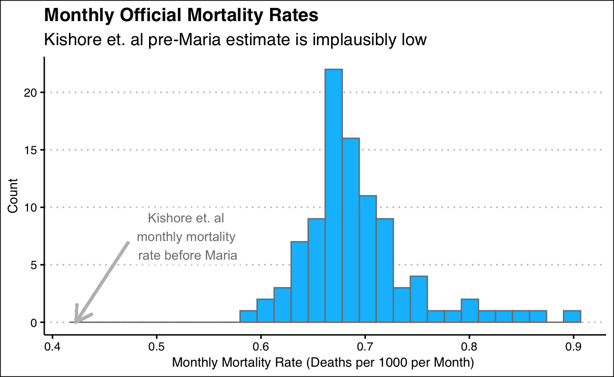
Figure 1: This plot is a histogram of the monthly mortality rates from 2010 to 2017 (before Hurricane Maria) in Puerto Rico. The x-axis is the monthly mortality rate and the y-axis is the count. The arrow points to the monthly mortality rate as per Kishore N (2018)’s calculations. In all, it is evident that the study’s estimate is implausibly low
In 2018, Kishore N (2018) argued that the mortality of Hurricane Maria was much higher than what was officially accepted. This resulted in controversy because Kishore N (2018)’s findings were alarmingly high as they did not follow the same parameters as official studies. Kane argues that the data used in Kishore N (2018)’s argument is lacking as explained in the discussion tab. This website provides an overview of this issue.